The Scenography (and the rest) of She Kills Monsters
February 26, 2026
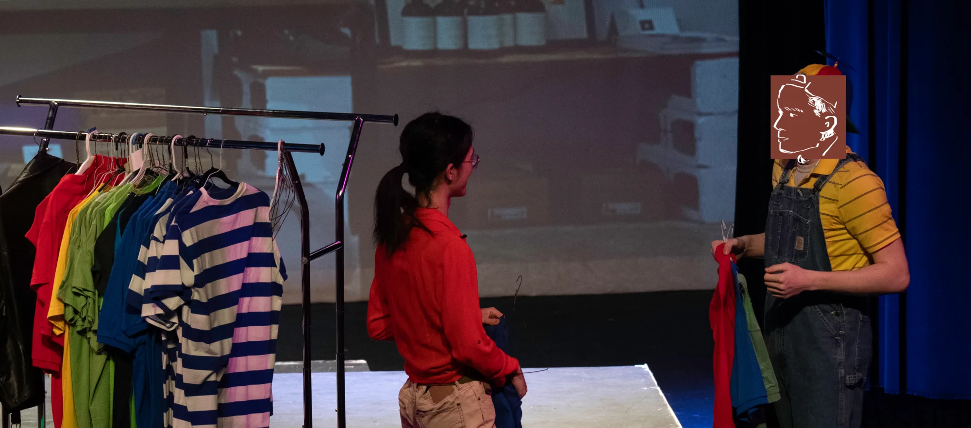
My school recently completed a production of She Kills Monsters written by Qui Nguyen, in which I played Vera/the Beholder in addition to doing miscellaneous technical work. This is the first time I played any role in a serious production, and I also spent quite some time on building the scenography that accompanies the set. This post is a retrospective on the technical aspects of the show.
Setting the tone
Yes, this is really how it looks.
Candidly speaking, I am not a big fan of the writing of the play. I do think it tells a somewhat cohesive story with a message that I really, really appreciate, but the somewhat fragmentary story arcs can distract the audience from it. Some of the plot points it opens up are unresolved or unexplained, and some of its humor are extremely unsophisticated. However, most of these are excusable considering that it debuted in 2011.
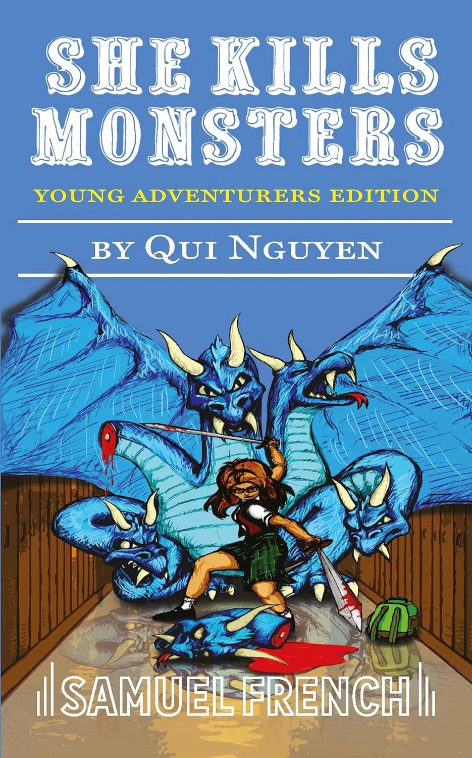
When I got the script, it came with a really, really awful design that looked like it was drawn with a mouse in powerpoint. Maybe this made sense for the publisher because most of the story happens within a highschooler’s custom DnD module, but this really is unacceptable for me.
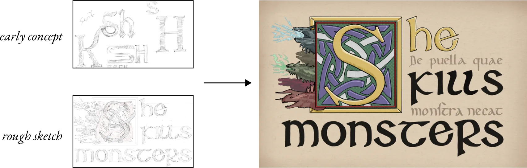
I started with the title typography, for which I imagined a variety of different styles as concepts, including a romantasy-style serif, modern stretched sans-serif, and maybe just Helvetica. In the end, I settled for a stereotypical fantasy visual style with Roman drop capitals, insular minuscules, and Latin marginalia.
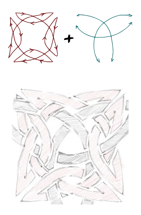
The minuscules went through some iterations for legibility, but there is only so much you can do without completely forgoing historical, or even stylistic accuracy. The Celtic knot behind the drop capital is a traditional design fused with a Borromean knot inspired by Lacan’s diagram of the sinthome. It is then furnished with the Tiamat drawing, which I hypothesize may be completely inaccurate due to my lack of DnD knowledge.
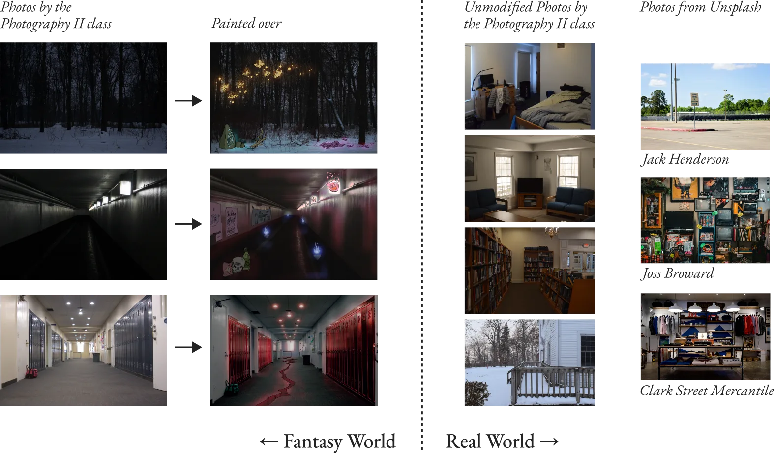
I collected other photos online and from the school’s photography class. Most of the fighting and drama occurs in the DnD fantasy world that reflects the dead protagonist’s struggle in high school, so I decided to use real photos of the school throughout the scenography. To delineate real-world from fantasy, I drew over the photos used in the fantasy setting and added a colored glow to some of these elements. I did not have the time to plan what to add or make separate backgrounds for different stages in the adventure through the fantasy world, but the intention is, at the very least, legible.
Tech Chaos
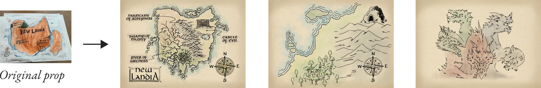
Some scenes required some hand-drawn “manuscripts”, for which I reused the background from the title typography. This included another sketch of Tiamat, which I tried to give a faithful rendition in reference to the 5th edition’s official art. There are two separate maps: a regional one used at the beginning of the show, and a large, detailed map of the entire “New Landia”. Since the show is set in Athens, Ohio, the prop team gave me the bright idea to make the shape resemble Ohio, like what was done for a separate map prop.
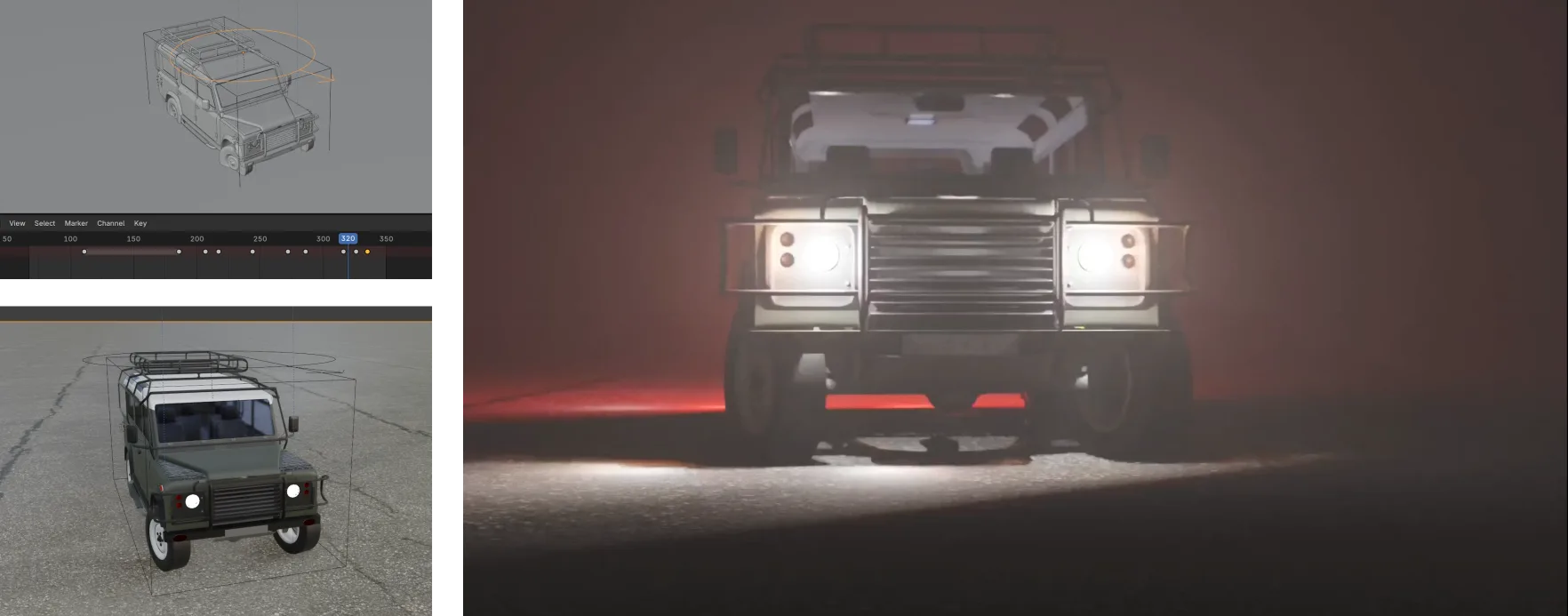
In the prologue, one of the protagonists dies in a car crash. I decided to pick up 3D animation again and rendered a somewhat awkwardly animated car crashing into the virtual camera and fading to white. This led me to wrestle with Blender’s volumetric fog rendering for quite a bit, but was overall easy thanks to an awesome, almost ready-to-use model of the Land Rover Defender 110.
The finale, a fight with a symbolic Tiamat, is the most complex asset in this set of projections. I decided to go with a procedurally generated 3D glowing spiral for the fight because we have people wearing dragon masks instead of a giant prop dragon to wiggle on stage. The ending, to me, lacked some of the necessary explanation and emotional build-up that would make this work as an true resolution. Because of this, I took the idea from the director to do a very literal flashback with bold typography that made sure the audience understand this is a mental battle for the protagonist to reconcile with her past.

The Show Begins
All the projections were programmed into QLab, which we just recently got a license for. QLab uses a very pure procedural logic, which was confusing at first. I anticipated that an expensive, professional software would prioritize ease-of-use, but it turned out that every parameter is controlled with a fader and not even a crossfade is built-in.
QLab had automatic infinite looping for videos and audios, but the complexity of the goto cues—I cannot believe the programming is more similar to assembly than video editing—made me decide that it is better to cut the video from the middle and stitch the two ends together with a crossfade in KdenLive to make the video assets seamless loops.
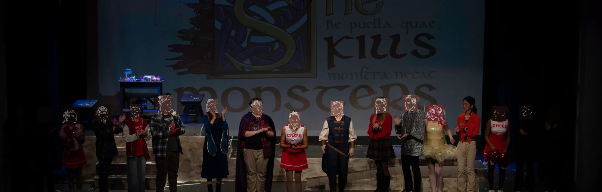
Running the cues demanded some practice from the technical crew, but the projection cues turned out to be the smoothest compared with lighting and audio. The two performances went mostly smoothly, which were a lot less stressful than I anticipated. It was a welcome success for my first time performing on stage.
I also want to mention that my involvement in the entire project started from several unlikely coincidences that made me consider participating in theater, which is something I have never even thought about before. I am surprised to see that a big part of my skillset became useful in this context, and especially in a small production with few professional resources outside of artistic direction. It gave me a reason to produce a larger-in-scale project of graphic design, which I appreciate as an addition to my archive.
mi tawa.